Sainsbury’s
Live Well For Less
After seven years of Jamie Oliver and ‘Try Something New Today’, and against the backdrop of the deepening Credit Crunch, it was time for some radical changes to Sainsbury’s marketing strategy. What followed was a major overhaul of all aspects of Sainsbury’s communications across the board. We created the line ‘Live Well For Less‘, alongside the identity featuring a map of Britain designed to be a rallying cry for Sainsbury’s values of quality and value in these stretched times. It caught the mood of the nation and was widely credited with Sainsbury’s performing better than most in the recession and winning many marketing effectiveness awards along the way.
In addition to the tagline and identity, we also created a bespoke typeface called Sainsbury’s Slab to be used on everything from shelf pricing and in-store promotions to advertising TV end frames and posters as well as online and digital. We audited all Sainsbury's communications output and created a full suite of guidelines, overseeing the roll out of the new branding.
Also shown here is a selection from the initial launch campaign for Live Well For Less, as well as the hugely successful Feed Your Family For £50 campaign.
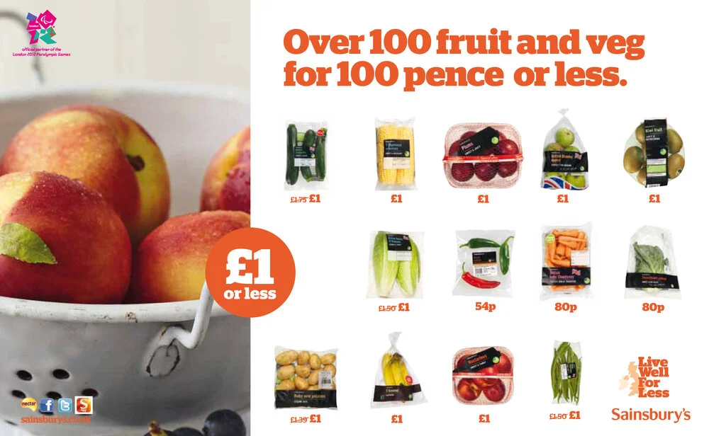
Next we have a sample of the many 'promo' ads that supermarkets rely on heavily to promote specific products and offers. Typically these type of ads are farmed out to a studio and churned out against a template and not given much love. But as they really are at the business end of the market, we felt these ads needed to share the look and feel and attention to detail and quality of their more glamourous counterparts to be truly effective.
Finally here we have the Sainsbury’s Brand Match campaign. Until this came along, working out where to get the best value for your money was an arduous task — collecting receipts, checking other supermarkets prices, filling in long online questionnaires. Sainsbury's did away with that with this initiative — they did all the checking for you and if any of your branded goods were cheaper elsewhere, they gave you a coupon at the till for the difference. The posters convey this boldness and simplicity.
There's lots of articles online about Live Well For Less. You can read one here.